You are using an out of date browser. It may not display this or other websites correctly.
You should upgrade or use an alternative browser.
You should upgrade or use an alternative browser.
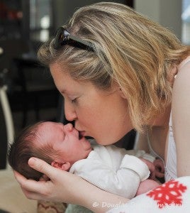
Holden interacting with his Mommy
- Thread starter Dave
- Start date
LOLOL!! Love it!! :biggrin:
And he is such a beauty; look at all that hair!
And he is such a beauty; look at all that hair!
Hehehe, priceless!
Yeah... that's what it's all about. I actually like your wife's expression as much as Holden's! :smile:
You have that moment forever. Isn't that nice?
Pictures are cute but, IMO, not well framed or cropped.
#1 is not square and not standard - and needlessly.
I would crop this much tighter and focus attention on the interaction, what gets cut off is, imo, not important or contributory. (it needs a little more contrast, I think)

#1 is not square and not standard - and needlessly.
I would crop this much tighter and focus attention on the interaction, what gets cut off is, imo, not important or contributory. (it needs a little more contrast, I think)

Subscribe to see EXIF info for this image (if available)
I actually like how the image shows her arm & body cradling the infant. Wonder where the 1st image was cropped?
I actually like how the image shows her arm & body cradling the infant. Wonder where the 1st image was cropped?
Without being a PITA, let me say that 'liking' an image isn't enough. To help the poster, and yourself, it is useful to dissect why having that bit of shoulder and hair adds to the image for you.
Is there more information. more feeling, better composition, more color?
That part of C/C is crucial to improving the eye.
No, Dave, for me, the original is better. The crop (suggested by Lew) is not enough to bring more focus on the picture, your original does that just fine. With the new crop, her head is too truncated and does not look natural. The one imporvement is does have is to remove the white/red object (blanket?) from the near bottom corner, but I think a dark vignette would do almost as well here.
Ohh the fun yer funny have !!!!
Gorgeous shot buddy & congrats to you all again !
Gorgeous shot buddy & congrats to you all again !
Congrats on the little one Dave.
Similar threads
- Replies
- 16
- Views
- 706
- Replies
- 0
- Views
- 510
Links on this page may be to our affiliates. Sales through affiliate links may benefit this site.Nikon Cafe is a fan site and not associated with Nikon Corporation.Forum post reactions by Twemoji: https://github.com/twitter/twemojiForum GIFs powered by GIPHY: https://giphy.com/


